
TL;DR
- Define and normalize core metrics—performance ratings, retention intervals, manager feedback—to a 0–100 scale for a Composite Quality Index.
- Automate data pipelines from ATS, HRIS, and performance systems to maintain fresh, reliable insights.
- Use dashboards (Power BI, Looker, Tableau) with alerts and drill-down filters to spot dips before they impact business outcomes.
- Compare sourcing channels by cost, time-to-hire, and quality-of-hire ROI; reallocate budget toward top performers.
- Guard against bias with quarterly audits, calibration workshops, and cohort validation against business KPIs.
Who this is for
- CTO / Head of Engineering deciding when and how to expand teams with high-quality hires
- Founders and Product Leads scoping roles, budget, and impact of new talent investments
- Talent Ops and Procurement leaders evaluating vendor models, sourcing channels, and risk metrics
Quick Framework: 5 Steps to Quality of Hire Metrics
- Define & Normalize – Select performance ratings, retention at 6/12 months, manager satisfaction; map each to 0–100.
- Integrate Data – Connect ATS (Greenhouse), HRIS (Workday), and 360 tools (15Five) via APIs or ETL.
- Calculate & Benchmark – Apply formulas for each metric and set targets (e.g., 75–90 performance, 70–85% retention).
- Visualize & Alert – Build dashboards in Power BI/Looker/Tableau with composite widgets, channel comparisons, and KPI thresholds.
- Optimize & Validate – Compare channels by ROI, reallocate budget, audit for bias, and correlate scores with revenue or project outcomes.
Quality of hire metrics reveal how well new team members boost retention, performance and cost efficiency. In this brief guide, we group these measures—performance ratings, retention intervals and manager feedback—and align them with benchmarks you can track today.
Building A Quality Of Hire Metrics Framework
This framework gives you a clear path to define, align and benchmark quality of hire metrics across different roles.
Follow these steps to start measuring quality of hire right away:
Summary Of Quality Of Hire Metrics
Here’s a quick overview of the main metric categories, what they measure and where most talent teams aim to land.
This table sets a baseline; adjust these targets as you gather your own data.
- Define Core Categories such as performance scores, retention intervals and hiring manager feedback.
- Set Benchmark Ranges by referencing industry norms (for example, 70–85% one-year retention and 75–90 performance ratings).
- Normalize Score Scales so each metric runs on a consistent 0–100 scale.
At Acme’s talent team, they noticed a 15% drop in retention from one sourcing channel over just three months. They quickly shifted budget into referrals, boosting their retention rate.
You can implement this framework in under a day. Start by exporting performance and retention figures from your HR system.
Next, send hiring managers a brief three-question survey. Finally, pull 6- and 12-month retention cohorts from your ATS.
Within a week, set your initial targets based on industry benchmarks. Then review these metrics in your monthly talent meeting to catch emerging trends early.
Tracking these metrics early helps you catch issues before they impact productivity and turnover.
This quick overview sets the stage for deeper dives in the next sections, where we’ll walk through exact formulas, data integration tips and dashboard best practices.
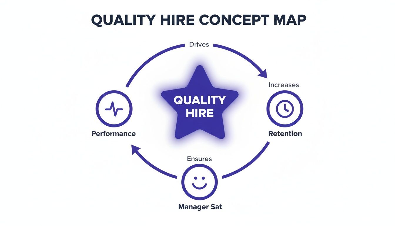
Understanding Key Quality Of Hire Concepts
Quality of hire isn’t just about filling seats quickly—it’s about building teams that deliver and stay together. Imagine each new recruit as an investment earning compound interest: small improvements in performance and retention create exponential gains over time. Shifting our focus from “time to fill” to a composite quality score helps us measure both immediate fit and long-term value.
- Time to Offer and Cost per Hire highlight recruitment efficiency.
- Composite Quality Scores blend efficiency metrics with performance and retention, giving a single strategic indicator.
Early process measures tell you how smooth hiring is. But to see if new hires truly contribute—and stick—you need quality metrics.
Analogy And Strategic Shift
Think of retention as interest accruing on your talent “capital.” Every person who stays past critical milestones boosts your overall balance. Performance ratings act like regular dividends, while manager satisfaction scores feed back into future hiring decisions.
Here’s how the main components come together:
- Performance Appraisal Rating normalized on a 0–100 scale captures work quality.
- 12 Month Retention Rate measures stability and engagement.
- Hiring Manager Satisfaction on a 0–100 scale reflects fit and collaboration.
- Time to Productivity indicates ramp speed and training effectiveness.
Talent teams average these normalized figures to produce a percentage-based quality of hire indicator. Most HR formulas weight each component equally to keep things transparent.
Real World Mini Cases
In a small software group, a monthly composite quality score revealed one sourcing channel lagged behind. Retention from that channel sank to 60% after six months, prompting a quick pivot in sourcing tactics.
At a mid-size AI startup, leaders sliced composite scores by candidate source and found employee referrals were consistently top performers. They reallocated 30% of their budget to referrals and witnessed a 20% uptick in hires meeting retention goals.
Small changes in sourcing allocation can yield compound improvements in team quality.
By 2025, 54% of talent leaders ranked improving quality of hire above employer branding and flexible work options. That shift pushes teams to merge retention, performance reviews, and manager feedback into unified KPIs.
Discover more insights about measuring quality of hire in the 2025 benchmarking research
Check out our guide on hiring software developers for more best practices on evaluating candidates.
Treat quality of hire as a true KPI by tracking progress over time. Trends in composite scores surface emerging issues before they affect productivity or morale. Like monitoring vital signs, regular reviews—monthly or quarterly—ensure your compound benefits stack up.
Embedding these metrics into executive dashboards holds hiring managers accountable and links sourcing choices to long-term outcomes. But beware skewed data from overly lenient reviews or inconsistent scoring scales—we’ll cover common pitfalls and guardrails next.
Getting started requires leadership buy-in and clear metric ownership. Assign team members to gather data from your ATS, HRIS, and performance systems. Then define your formulas and set initial benchmarks based on team size and role complexity.
With these foundations in place, you’ll be ready for precise calculations, seamless integrations, and dynamic dashboards. Next, you’ll learn exact formulas for each metric and how to gather dependable data. Let’s proceed.
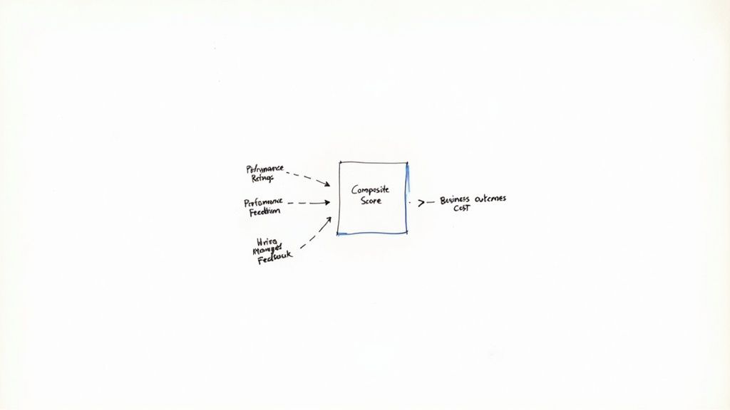
Calculating Core Quality Of Hire Metrics
Now that you understand why these measures matter, let’s roll up our sleeves and do the math. Below, you’ll find each metric’s formula, data source, and practical tips to keep everyone aligned.
Here are the core metrics we’ll cover:
- Performance Appraisal Score: Average rating on a 0–100 scale.
- Retention Rate: Percentage of hires still with you at 6 and 12 months.
- Hiring Manager Satisfaction: Survey score on a 0–100 scale.
- 360 Feedback Score: Combined peer and direct-report ratings.
- Composite Quality Index: Weighted average of the normalized scores.
Below is a concept map visualizing how performance, retention, and manager satisfaction connect.
This diagram shows how each metric feeds into your overall picture of hire quality.
Standardizing Score Scales
First, bring every metric onto the same 0–100 range. For performance appraisals, use:
(Actual Score − Minimum Score) ÷ (Maximum Score − Minimum Score) × 100
Next, calculate retention like this:
(Hires at milestone ÷ Total hires in cohort) × 100
Pull that data from your HRIS or ATS.
A simple tip: if one team rates performance from 1 to 5, map 1→0 and 5→100. That way, no single metric skews your Composite Quality Index.
Comparison Of Core Quality Of Hire Metrics
Before you dive in, here’s a quick snapshot of each metric side by side—formulas on the left, data sources on the right.
This table gives you a clear reference so every stakeholder knows where to find data and how to run the numbers.
Example Calculation
At InnovateAI, we ran a pilot on 50 hires. Their average performance score was 80, 12-month retention hit 72, and manager satisfaction scored 85.
Once we normalized those figures to a 0–100 scale, the Composite Quality Index landed at 79. That single number helped us compare sourcing channels without guesswork.
Interestingly, a 10-point dip in the index often showed up just before early departures—an early warning sign worth tracking.
Steps to replicate this:
- Export raw performance, retention, and satisfaction data.
- Normalize each metric using the formulas above.
- Average the normalized results for your Composite Quality Index.
- Plot the index over time in a BI dashboard for ongoing insight.
Best Practices You Need To Know
Consistency is your secret weapon. Keep rating scales uniform, audit data monthly, and revisit formulas every quarter.
- Document each formula and track version history.
- Train hiring managers and HR partners on data collection.
- Audit data feeds for missing or duplicate entries.
- Adjust metric weights if priorities shift.
- Aim for at least 30 hires per cohort to ensure statistical reliability.
With these steps in place, you’ll have a clear, repeatable process for measuring quality of hire. Next, we’ll tie these calculations into a live dashboard so you can spot trends and share insights in real time.
Integrating Data For Quality Of Hire
Quality-of-hire insights only work when your recruiting and HR systems talk to each other without hiccups. Imagine your applicant tracking system (ATS), HR information system (HRIS), and performance management tool as pieces of a puzzle—they reveal the full picture only when you snap them together.
Automating data exports cuts out manual uploads and keeps your metrics fresh. For example, set up scheduled exports of performance scores so you never scramble at review time.
- Connect ATS and HRIS via APIs or CSV exports
- Consistently map employee IDs and hiring dates
- Automate retention snapshots at 6-month and 12-month milestones
- Standardize all scorecards to a 0–100 scale
Choosing the right timeframes helps you catch early hiccups and long-term trends. Metrics at six months highlight onboarding issues, while 12-month stats reveal who’s sticking around.
Setting Up Automated Reports
Defining your report schema is like laying the rails for a train—it ensures smooth travel from ATS to your data warehouse. Start by matching each ATS field with the corresponding HRIS label.
- Pinpoint key fields: performance scores, hire dates, employee status
- Build data pipelines using scheduling tools (Airflow, cron) or ETL platforms (Informatica)
- Validate daily to catch mismatches before they snowball
- Trigger alerts when entries go missing or duplicate
A quick transformation rule can unify scales. For instance, convert a 1–5 scale to 0–100 by subtracting 1, dividing by 4, then multiplying by 100. It’s a small step that keeps every score speaking the same language.
Integrating Retention And Feedback
Retention figures from your HRIS tell you who’s staying and who’s heading for the exit. Mix that with 360-degree feedback from your performance tools to see patterns emerge.
- ATS feeds you real-time hire dates and status
- HRIS delivers monthly retention and turnover rates
- Performance platforms push review scores quarterly
Keeping these scores aligned prevents one measure from overshadowing the rest. Store everything in a cloud database for quick, ad-hoc queries.
Recent surveys show 89% of TA pros believe quality-of-hire will matter more in the coming years, yet only 23–25% of organizations feel they can calculate it accurately today. Meanwhile, 62% lean on performance appraisals, 45% track retention, and 28% use 360° feedback. Dive deeper into these findings in the Jobylon quality-of-hire insights.
“A unified data flow cut our manual checks by 90%,” said an HR lead at a fintech startup.
Automation isn’t a magic wand—but it does save hours of grunt work and keeps your metrics reliable.
- Feed insights into monthly talent reviews
- Assign dedicated owners for each data stream
- Build dashboards with drill-down filters
- Track composite scores to spot source-level trends
- Refresh your metrics every quarter to stay nimble
By automating these integrations, you ditch spreadsheets and maintain a single source of truth. Your team can then focus on sourcing great candidates instead of wrestling with data—and that drives real business impact over time.
Optimizing Sourcing With Quality Of Hire Metrics
When you tie each hire back to its origin, quality metrics cut through the noise. By comparing cost-per-hire, time-to-hire and one-year retention across channels, you’ll know exactly where to invest for the best returns.
Here Are The Core Metrics:
- Qualified Candidates Per Source: Count of applicants who meet your baseline criteria.
- Cost-per-Hire Per Source: Total recruiting spend divided by hires from that channel.
- Time-to-Hire Per Source: Days between application submission and offer acceptance.
- 12-Month Retention Rate: Percentage of hires still on the team after one year.
- Top-Performer Percentage: Share of hires rated “meets or exceeds expectations.”
Framework For Source Comparison
To begin, export channel data from your ATS and HRIS. Then plot each source on a simple chart—cost on the X-axis, quality on the Y-axis.
Sample Breakdown:
- Employee Referrals cost $5k, retention 80%, performance 65%
- Niche Job Boards cost $7k, retention 75%, performance 60%
- Volume Job Sites cost $3k, retention 60%, performance 45%
- Social Media Sourcing cost $4k, retention 65%, performance 50%
Employee referrals yield higher retention and performance per dollar than volume sites.
This visual quickly highlights which channels clear your cost and quality thresholds.
Example Of Budget Reallocation
Acme Corp saw that referrals outperformed other sources by 15% on a composite quality score. They decided to shift 30% of their budget from generic volume sites into referrals and niche boards, driving better outcomes.
Follow These Steps:
- Gather six months of data on each source.
- Normalize cost, time and quality scores to a 0–100 scale.
- Rank channels using a composite ROI formula: (performance × retention) ÷ cost.
- Reallocate budget quarterly and track the bumps in metrics.
The talent team also reviews these numbers every month to spot trends early.
Using quality-of-hire metrics to guide sourcing doesn’t just cut costs. It ties hiring investments directly to future performance and stability.
Global recruiting benchmarks in 2025 recommend tracking quality by source—and they’ve found systematic differences. For instance, employee referrals typically produce higher-quality hires at a lower cost-per-hire, while volume sites bring in more applicants but suffer in retention and performance. Learn more in the Global Recruiting Benchmarks 2025 report.
Many talent teams discover that even when a channel’s cost-per-hire is higher, a better-quality hire reduces turnover. Industry data from SHRM estimates 26% of new hires separate within their first year, creating hefty replacement costs.
Beyond turnover, business impact multiplies with better hiring. Studies by Gartner show top performers can deliver around 2.5x the impact of average employees. Shifting just a few percentage points more new hires into the “meets or exceeds expectations” bucket (>50–70%) can drive real revenue and productivity gains.
For deeper tactics on assessing senior AI/ML and software engineering talent, check out our guide on hiring AI engineers.
Building Dashboards For Quality Of Hire
Turning raw quality-of-hire figures into clear visuals calls for a smart dashboard design. A good layout tracks your composite quality score, compares channels and triggers alerts if key metrics dip. Below is a template any hiring team or executive can adopt right away.
Follow this step-by-step approach:
- Define Composite Score Widgets
- Set Channel Comparison Charts
- Establish KPI Threshold Alerts
- Add Drill-Down Filters
For instance, place Composite Quality Index, Retention Rate, and Manager Satisfaction side by side. This side-by-side view helps you spot dips before they become problems.
Choosing Chart Types
Picking the right chart makes data speak clearly. Use line charts to follow trends, bar charts for side-by-side comparisons, and gauges to show live KPI status. Here’s a quick guide:
“Effective dashboards prompt decisions, not long meetings,” says an HR analytics lead.
Well-designed visuals turn numbers into narratives that drive action.
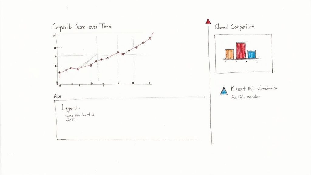
This example dashboard highlights composite scores by channel. You’ll notice alerts when the retention curve falls below 75%, helping you intervene before it impacts the business.
Interpretation shows Channel A lagging in retention while Channel B excels in manager feedback. Those insights steer your sourcing and interview tweaks.
Setting KPI Thresholds
Establishing clear thresholds keeps surprises at bay. A simple color scheme works well:
- Green Above 80%
- Yellow Between 70%–80%
- Red Below 70%
Tie these thresholds to email or Slack notifications so teams can adjust sourcing or refine interviews as soon as a metric turns red.
Building The Dashboard
Here’s how to bring everything together:
- Pull composite scores from your ATS exports
- Import retention figures from your HRIS
- Widgets for composite scores, bar charts and gauge indicators
- Set rules in your BI platform or a dedicated alert tool
- Grant view rights and schedule weekly email digests
- Standardize score scales to keep metrics aligned.
- Validate data feeds every day to avoid gaps.
- Include drill-downs so leaders can slice data by team or source.
- Refresh visuals seasonally to maintain engagement.
- Rating-Scale Inflation when managers give everyone top marks.
- Feedback Bias when survey answers reflect individual preferences.
- Over-Reliance on Retention without tying it back to on-the-job performance.
- Run cohort analyses that compare hires from different quarters.
- Create control groups from earlier recruitment waves.
- Automate monthly correlation checks in your dashboard.
- Weight scores based on headcount, so small teams don’t skew results.
- Account for senior vs. junior roles when you compare apples to oranges.
- Normalize ratings each quarter against group-wide performance.
- Document every rating scale and its formula.
- Audit manager scores each month for outliers.
- Cross-reference metric trends with your core KPIs.
- Tweak weightings as roles and responsibilities shift.
- Train new managers on a shared scoring approach.
- Lead with a concise slide deck and the adjustment checklist.
- Ask for feedback on your validation methods.
- Emphasize reduced hiring risk to reassure cautious stakeholders.
- Propose a small pilot before a full-scale rollout.
- A bent lens skews every photo you take.
- Likewise, scale inflation distorts every hire score.
- Regular calibration keeps the picture sharp.
- Always align scores with tangible outcomes.
- Cross-verify data from multiple sources.
- Refresh your framework every six months.
- Sampling bias in small cohorts.
- Seasonal swings across hiring cycles.
- Response bias in voluntary surveys.
- Measurement bias from inconsistent tools.
- Review scoring scales before each quarter.
- Schedule calibration workshops for feedback.
- Track trends weekly to catch any drift early.
- Define core metrics and normalize to 0–100.
- Set benchmarks using industry norms (75–90 performance, 70–85% retention).
- Automate data integrations (ATS, HRIS, performance).
- Build dashboards with alerts in Power BI/Looker/Tableau.
- Compare sourcing channels with composite ROI formula.
- Schedule quarterly audits and calibration workshops.
- Book a 20-min scope call to Start a Pilot and define your quality-of-hire roadmap.
- Download the CSV checklist to standardize your metrics framework.
- Review our sample profiles to align job descriptions and interview kits.
- McKinney Chamber benchmarking research
- Guide on hiring software developers
- Jobylon quality-of-hire insights
- Global Recruiting Benchmarks 2025
- ThirstySprout guide on hiring AI engineers
- Tools: HRIS, ATS, 15Five
- Dashboard platforms: Power BI, Looker, Tableau
Best Practices You Need To Know
Learn more about organizing hiring workflows in our article on recruitment project management.
This template gives you a live snapshot of quality-of-hire performance, nudging you toward fast, informed decisions. By tracking composite scores, comparing channels and flagging breaches, you’ll channel resources where they yield the best talent.
Integrating Alerts Into Workflows
Automated alerts keep everyone on the same page when KPIs slip. A quick Slack ping can tag hiring leads for immediate follow-up. Weekly summary reports should unpack dashboard highlights in detail.
Automating alerts drives adoption and reduces response time by up to 50%, according to industry benchmarks.
Review alert effectiveness each quarter and tweak your thresholds to match evolving goals. Then lock in a monthly dashboard review with stakeholders to sustain momentum and accountability.
Start building your quality-of-hire dashboard today to unlock faster insights and better hires.
Avoiding Common Pitfalls In Quality Of Hire Metrics
It’s tempting to believe perfectly defined metrics will steer you right. In reality, small issues can send your hiring data off-course.
Validation Techniques
To catch hidden gaps, map your quality scores back to real business results.
For instance, line up a candidate’s composite rating with revenue growth or project completion rates.
Score Adjustment Checklist
Beware of one-size-fits-all scoring—adjust for team size and role complexity.
Pitfall Case Study
At NeoTech, lenient reviews sent composite hiring scores sky-high. Managers rated new engineers at 95/100, yet their actual output fell short of targets.
This simple table shows how dialing back scale inflation brings your metrics back in line with retention.
“Validating quality of hire metrics against outcomes prevents costly misdirection.”
Guardrail Steps
Keep your program honest by following a top-down checklist:
These guardrails cut down bias and keep your numbers grounded in reality.
Stakeholder Engagement Tips
Winning over leaders early pays dividends. Combine data with storytelling to make your case stick.
Bias Analogy
Think of your metrics like a camera lens:
Share this analogy to help teams spot bias before it creeps in.
“Early bias detection keeps your hiring on target.”
Final Takeaways
Without context, metrics turn into myths.
Honest quality-of-hire measures lead to smarter talent decisions.
Common Data Biases
Over time, shifting definitions can erode your benchmarks. Watch for:
Expand cohorts, standardize tools and rotate question formats. Regular data audits surface hidden issues before they taint your metrics.
Next Steps
Embed these guardrails in your next hiring cycle:
Partner with ThirstySprout to scale hiring at ThirstySprout
Checklist: Quality of Hire Metrics Implementation
What to do next
References
Hire from the Top 1% Talent Network
Ready to accelerate your hiring or scale your company with our top-tier technical talent? Let's chat.