
You’re probably here because the product is moving faster than the interface. The backend works, the model output is promising, and customers still hesitate in onboarding, drop in setup, or flood support with avoidable questions. That usually isn’t a “make it prettier” problem. It’s a product problem showing up through the UI.
Founders often hire UI help too late or for the wrong scope. They buy screens when they need decisions. They ask for polish when the actual gap is flow, clarity, trust, and handoff discipline between product, design, and engineering.
TL;DR
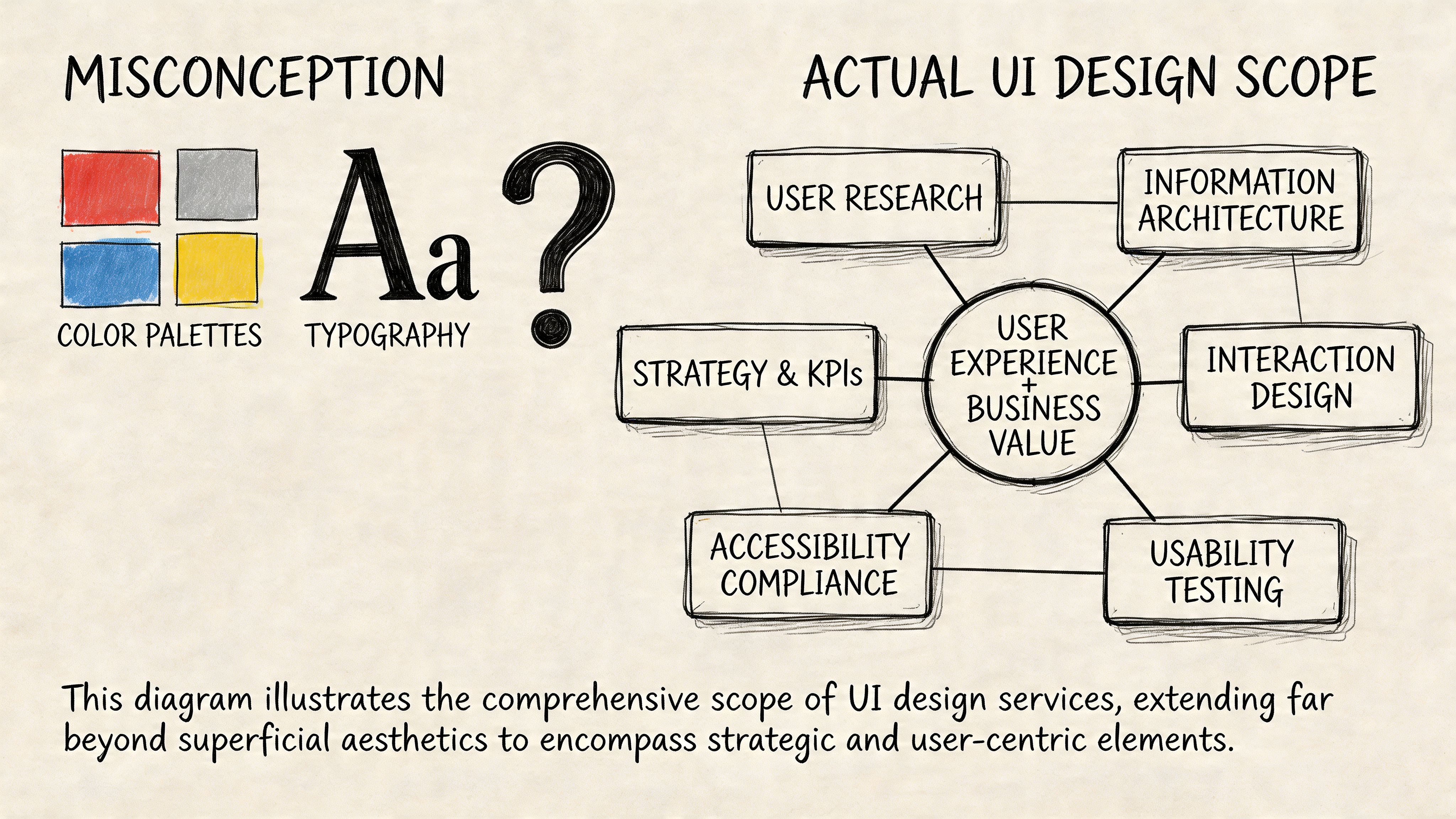
- User interface design services should cover research, flows, wireframes, prototypes, visual design, and design system thinking. Not just mockups.
- Your hiring model matters as much as the designer. Agency, freelancer, and embedded designer each solve different problems.
- A strong UI hire shows process, trade-off thinking, and comfort with engineering constraints. A glossy portfolio alone isn’t enough.
- Onboarding should start with product context, tool access, sprint rituals, and clear success metrics like Task Success Rate (TSR).
- For AI products, the next wave isn’t just screens. It’s trust, behavior rules, service design, and screen-light or screenless interactions.
What to Expect from UI Services Beyond Pretty Screens
Most first-time buyers of user interface design services think they’re paying for a layer of visual polish. In practice, the useful work starts much earlier.
A strong UI engagement begins by reducing product ambiguity. Before anyone chooses type scales or button styles, the designer should understand the user, the task, the business goal, and the constraints your engineers face. If that work doesn’t happen, you usually get attractive files that create rework later.
What a professional engagement usually includes
A practical UI scope usually has these building blocks:
Research and problem framing
Here, the team learns how users think about the workflow. For an AI product, that might mean how users verify outputs, recover from bad suggestions, or escalate to a human.Information architecture
Someone has to decide what belongs where. Navigation, hierarchy, labels, and task grouping matter more than visual style in early-stage products.Wireframes
Low-fidelity wireframes let the team test flow and structure before anyone argues about gradients or brand details.Interactive prototypes
A prototype answers the question engineers ask next: “What happens when the user clicks this?” Good prototypes reduce assumptions around states, transitions, empty views, and error handling.Visual design
This is the layer founders usually picture first. It matters, but it should rest on validated structure.Design system setup
A reusable component library keeps new features from drifting into inconsistency. It also makes design handoff less fragile.
What deliverables you should expect
If the vendor says they “do UI” but can’t name outputs, that’s a warning sign.
A healthy engagement often produces deliverables like:
- User journey maps that show where people get blocked
- Annotated wireframes for core flows such as signup, billing, or approval
- Clickable prototypes in Figma for design review and usability testing
- Component inventories that define buttons, inputs, tables, alerts, and states
- Handoff notes for engineering, including behavior and edge cases
Practical rule: If a designer can’t show how they move from user problem to screen decision, you’re not buying a product thinker. You’re buying surface decoration.
Where founders under-scope the work
The common mistake is to hire for a landing page mindset when the product needs operational design. That gap shows up fast in AI and SaaS products.
Consider two examples.
Example 1. AI support copilot
A startup asks for “a cleaner dashboard.” The underlying issue is that agents don’t trust suggested answers. The right UI work isn’t only a dashboard refresh. It includes confidence signaling, edit-before-send behavior, fallback states, and escalation paths.
Example 2. Fintech onboarding flow
A founder wants a more modern look for account setup. The primary friction is document upload, field validation, and progress visibility across multiple steps. A good UI team redesigns the journey, not just the screen chrome.
Service design is where top-tier UI work separates itself
This is the part many teams miss. Some of the best user interface design services go beyond what happens on a screen and connect the interface to the full customer journey.
That matters because users don’t experience your product as isolated screens. They experience onboarding emails, support handoffs, approvals, AI behavior, trust signals, and internal operations as one system. The UXPlanet piece on service design and experience governance is useful here because it frames a real shift in the field. As AI products make some interfaces less visible, design work starts to include experience governance and operating rules for behavior, escalation, and control.
For founders, the takeaway is simple. Ask whether the design partner can think beyond pixels.
If you want a practical outside reference for how teams evaluate interaction quality and testing discipline, Mr. Green Marketing UX services is a useful example of the broader testing conversation around experience quality.
A simple scoping checklist before you hire
Use this in your first vendor or candidate call:
- Core journeys: Which user flows are in scope right now?
- States and edge cases: Have they named loading, empty, error, and approval states?
- Research input: Will they speak with users or rely only on stakeholder opinions?
- Engineer handoff: How will specs, tokens, and interaction behavior get documented?
- System thinking: Can they explain what happens outside the screen?
If they answer mostly in visual terms, the scope is too shallow.
Choosing Your Engagement Model Agency vs Freelancer vs Embedded
Founders usually ask, “What’s the best way to hire UI help?” The better question is, “What problem am I trying to solve over the next two quarters?”
A freelancer, agency, and embedded designer can all be the right choice. They just solve different failure modes. One is good for speed on a contained task. One is good for shipping a broader initiative. One is good for creating product continuity over time.
UI Design Hiring Model Comparison
| Criterion | UI/UX Agency | Freelance UI Designer | Embedded (In-House/Fractional) Designer |
|---|---|---|---|
| Best fit | New product launch, redesign, or multi-stream initiative | Focused feature, short audit, or temporary execution gap | Ongoing product development and close cross-functional work |
| Speed to start | Moderate. Intake and scoping usually take time | Often fast if scope is narrow | Slower if full-time, faster if fractional |
| Strategic depth | Usually strong if the agency includes research and systems thinking | Varies widely by individual | Strong when the person is close to roadmap and users |
| Execution bandwidth | Broad. Can cover research, UI, prototyping, and design systems | Limited to one person’s capacity | Depends on seniority and internal support |
| Context retention | Medium. Good agencies document well, but they’re still external | Low to medium unless retained over time | High because they work inside product decisions daily |
| Engineering integration | Good if process is mature, weaker if handoff is treated as a delivery event | Depends entirely on the individual | Usually strongest due to daily collaboration |
| Flexibility | Good for defined workstreams, less flexible when priorities keep shifting | High on small tasks, weaker on complex changing scope | High if role is empowered and priorities are clear |
| Management overhead | Lower once a strong agency lead is in place | Higher. Founders often end up acting as creative director | Medium. Internal alignment still takes work |
| Risk profile | Process risk is lower, budget control can be harder if scope is fuzzy | Quality variance is highest | Hiring risk is front-loaded, payoff is longer-term |
When an agency makes sense
Agencies fit when you need more than one skill at once. If the work includes research, UX, interface design, prototyping, and design system setup, a good agency can bring that stack faster than a founder can assemble it solo.
Agencies are also useful when the product needs a reset. If the current experience is fragmented and nobody internally owns the design language, outside structure can help.
What doesn’t work is hiring an agency for “ongoing product thinking” while keeping them far from roadmap decisions. That model often produces polished deliverables with weak adoption inside the team.
When a freelancer is the right call
Freelancers work well when the problem is bounded.
Examples:
- A billing settings refresh
- A usability pass on one onboarding flow
- A Figma cleanup before engineering starts
- A prototype for fundraising or customer demos
The risk is management drag. Many founders underestimate how much direction a freelance designer needs if there’s no product manager or senior designer internally. If your brief is fuzzy, the freelancer won’t fix that. They’ll mirror it.
Hire a freelancer when you can define the problem clearly in one page. If you can’t, you probably need a broader product design partner.
When embedded wins
An embedded designer, full-time or fractional, is often the best choice once design is part of weekly product execution rather than a one-off project.
This model tends to work best when:
- Engineers ship continuously
- Product priorities change often
- The team needs live design review, not just deliverables
- Design system consistency matters across multiple releases
An embedded designer also catches cross-team issues earlier. They see where PM language confuses users, where engineering constraints change interaction details, and where customer feedback should alter the roadmap.
For teams evaluating staffing options more broadly, ThirstySprout’s guide to staff augmentation vs managed services is a practical lens for deciding how much day-to-day control you want to retain.
A founder decision filter
Use this quick filter before you choose.
Pick an agency if you need a broader sprint of capability and don’t already have design leadership.
Pick a freelancer if the work is tight, well-scoped, and easy to review against clear acceptance criteria.
Pick embedded if design has become a recurring operating function, not a project.
Mini-case examples
Example 1. Seed-stage AI workflow tool
The team has no designer, a rough but promising product, and a clunky onboarding flow. An agency is often the cleanest starting point if it can handle research, core flows, prototype validation, and first-pass system setup.
Example 2. Series A fintech platform
The company already has PMs and a design language, but feature complexity keeps rising. A senior embedded designer or fractional lead usually boosts productivity because they can work directly with engineering every sprint.
The biggest mistake isn’t choosing the wrong model forever. It’s choosing the wrong model for the next decision horizon.
The UI Design Interview Kit How to Vet Top Talent
A polished Dribbble-style portfolio can hide weak product judgment. You’re not hiring someone to make static art boards. You’re hiring someone to improve decisions users make in your product.
That standard got higher after the iPhone reset user expectations around touch, responsiveness, and intuitive interaction. Apple’s 2007 launch popularized multitouch and pushed mobile-first usability into the mainstream, which is why modern designers are expected to meet a much higher bar for responsiveness, accessibility, and clarity across digital products, as outlined in Adobe’s history of UI overview.
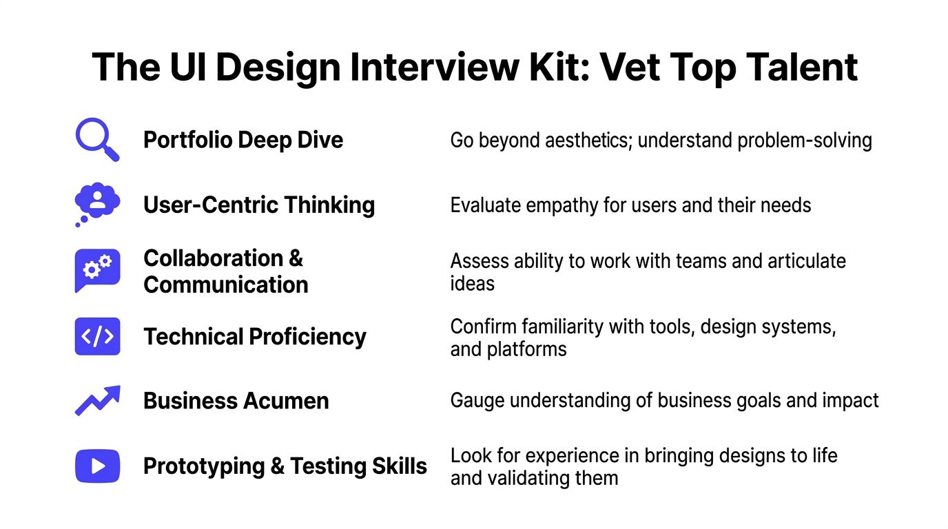
Start with the portfolio, but review it like an operator
Don’t ask, “Does this look good?” Ask, “Can this person explain the business problem, user friction, decision path, and implementation trade-offs?”
Red flags in a portfolio review:
- Only final screens: No wireframes, no rejected options, no evidence of iteration
- No constraints: They never mention engineering limits, compliance needs, or platform rules
- Template dependence: Different products look suspiciously similar
- No outcomes framing: They can’t articulate what changed for the user
- Weak collaboration story: Engineers, PMs, and researchers are absent from the narrative
A strong candidate usually shows rough work, not just polished work. That’s where their judgment lives.
Interview questions that surface real skill
Use questions that force decision-making, not self-description.
Here’s a practical interview kit:
Walk me through a project where the first design direction was wrong. What changed your mind?
You want humility, learning speed, and evidence of iteration.How do you handle disagreement with an engineer who says a design is expensive to build?
Good answers balance user value with implementation reality.Show me how you think about error states, empty states, and loading states.
Weak designers obsess over the happy path. Strong ones design the whole experience.What would you audit first in our onboarding flow?
This shows whether they can diagnose quickly without pretending certainty.How do you know a design is working after launch?
Look for fluency with product metrics, usability testing, and support signals.How have you used a design system, and when did you choose not to?
Good designers know systems are tools, not religion.
If you need a role definition before running interviews, this UI UX designer job description helps separate execution-heavy and strategy-heavy expectations.
Hiring lens: The best candidate usually speaks clearly about trade-offs. Not just taste.
A take-home that respects everyone’s time
Don’t ask for a full redesign over a weekend. That filters for free labor and endurance, not judgment.
A better exercise is small and diagnostic.
Sample take-home brief
Ask the candidate to review a single critical flow, such as account creation or AI result approval, and submit:
- A short problem summary
- One annotated wireframe or lightweight prototype
- Key assumptions and open questions
- A note on how they’d validate the change
What you’re evaluating:
- Problem framing
- Ability to simplify
- Interaction thinking
- Written communication
- Respect for uncertainty
A simple scorecard
| Area | What good looks like |
|---|---|
| User thinking | Talks about jobs, friction, and trust, not just screens |
| Craft | Clean hierarchy, clear states, sensible interaction patterns |
| System sense | Reusable components, consistency, naming discipline |
| Collaboration | Can explain decisions to PMs and engineers |
| Business judgment | Connects design choices to adoption, activation, or support load |
| Validation habit | Seeks feedback before over-polishing |
Example 1. Strong candidate
They show a messy early flow, explain why users hesitated, describe how they changed hierarchy and feedback, and tell you what engineering pushed back on.
Example 2. Weak candidate
They present beautiful screens, use a lot of brand language, and can’t explain what problem each decision solved.
That distinction matters more than visual taste.
Onboarding and Collaboration for Maximum Impact
The contract is signed. The actual test starts on day one, when your new designer meets your roadmap, your Slack habits, and your engineering team’s patience.
A good onboarding month creates shared context fast. A bad one turns the designer into a ticket taker or, just as bad, into a detached critic who never really plugs into shipping.
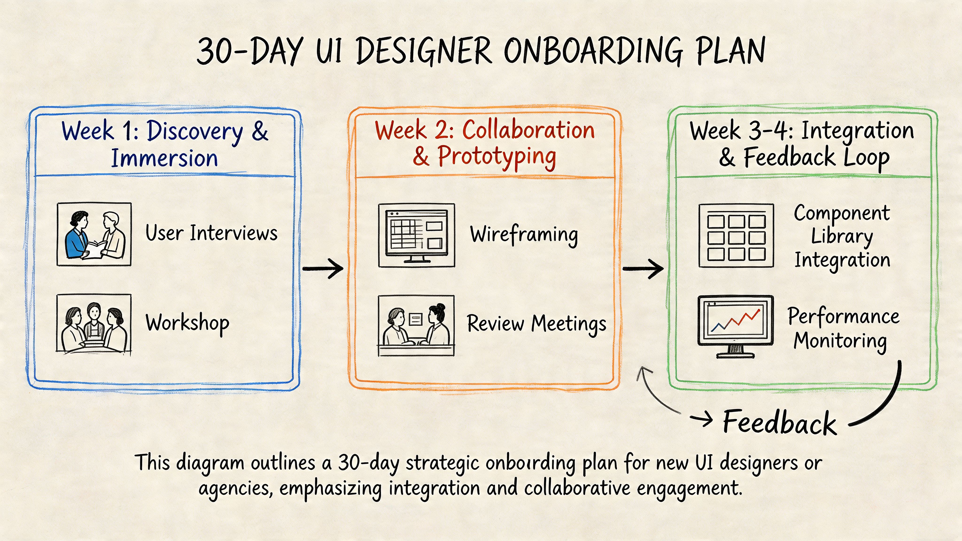
Days 1 to 10 focus on context, not output
In the first stretch, give the designer access to the tools and the truth.
That means Figma, Jira, Slack, analytics, support transcripts, product demos, and a blunt overview of where users struggle today. Don’t clean up the story. The useful work starts when they see where the team is confused.
A practical first-week packet should include:
- Core user personas: Even if they’re lightweight
- Critical flows: Onboarding, upgrade, setup, approval, export, or whatever drives value
- Known friction points: Support complaints, abandoned steps, confusing terminology
- Technical constraints: Platform rules, existing component library, accessibility concerns
- Decision owners: Who approves what, and how quickly
Define success metrics in week one
The first month shouldn’t be judged on “better visuals.” It should be judged on whether the designer can improve a critical user task.
Task Success Rate is one of the clearest early metrics. A practical UI methodology is to baseline TSR with 5 to 10 users and target more than 90% for critical flows. The same benchmark also notes that inline validation can boost TSR by 22% and transparent progress indicators can reduce abandonment by 31%, which is why these basics belong in onboarding priorities from the start, according to What If Design’s UI research write-up.
Don’t onboard a designer with only brand guidelines. Onboard them with a user task that matters.
Days 10 to 20 build working rhythm with engineering
At this point, teams often either gain speed or create resentment.
The designer should join sprint planning, design reviews, and handoff conversations early. Not as a guest, but as part of the product loop. Engineers need a way to ask about behavior, edge cases, and responsive states before development starts.
Example 1. Good onboarding rhythm
Every new flow gets a short review with PM, designer, and engineer. The team checks interaction states, assumptions, component reuse, and open implementation questions before the ticket is considered ready.
Example 2. Bad onboarding rhythm
Design happens in a separate lane. Engineers get a Figma link and guess at hover states, mobile behavior, validation, and copy hierarchy.
One useful perspective here comes from Underdog.io's view on design interview challenges. The same logic applies after hiring. If the process over-indexes on performance in isolation, you’ll miss how the designer collaborates in a product environment.
A short working session often helps more than another static review. This video is a good prompt for teams that need to tighten collaboration habits:
Days 20 to 30 should produce one real improvement
By the end of the first month, the designer should have shipped or nearly shipped a meaningful change. Not a grand redesign. One real improvement.
Good candidates for that first win:
- Onboarding validation cleanup
- Progress visibility in a multi-step flow
- A clearer empty state in a dashboard
- A trust layer for AI-generated output review
That first shipped change matters because it teaches the team how design work turns into product value. It also shows whether your process supports collaboration or impedes it.
Budgeting and Measuring the ROI of UI Design
Most founders ask the wrong budget question first. They ask, “What should UI design cost?” before asking, “What problem are we paying to remove?”
User interface design services are worth very little if they stop at visual refresh. They become valuable when they reduce abandonment, support burden, and implementation waste while increasing activation, conversion, and trust.
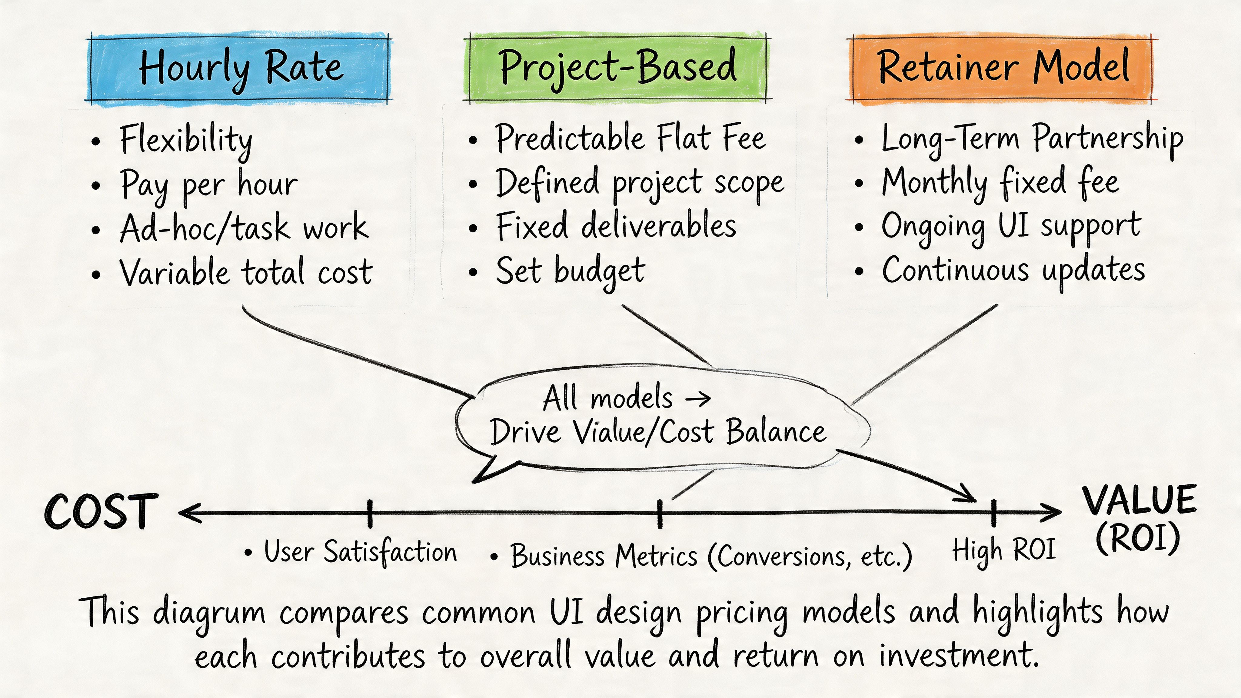
The pricing models you’ll encounter
Most UI work is sold in one of three ways.
| Model | When it works | Where it breaks |
|---|---|---|
| Hourly | Useful for audits, advisory work, or evolving scope | Easy for founders to lose budget control if priorities are fuzzy |
| Project-based | Good for a defined redesign, launch scope, or prototype package | Change requests can turn every new insight into a negotiation |
| Retainer | Good when design is a recurring operating need | Weak if there’s no clear product owner driving priorities |
The right model depends on your product maturity.
A narrow problem, such as fixing one onboarding sequence, usually fits hourly or project pricing. Ongoing feature work with a live roadmap tends to fit retainer or embedded staffing better.
Measure design like a product investment
The business case for design gets stronger when you connect interface quality to user behavior.
According to HatchWorks’ user experience statistics summary, expert-level UI design services can yield 200% to 400% conversion uplifts when teams systematically address abandonment and conversion pitfalls. The same source notes that 50% of users churn after one bad UX, 48% interpret poor mobile UI as business apathy, and design-led firms have been cited as outperforming the S&P by 228%. It also recommends measuring Error Rate with a target below 1%.
Those numbers shouldn’t be used as a promise for your product. They should shape what you track.
The metrics that actually matter
For most SaaS and AI teams, the useful dashboard includes:
- Conversion by step: Where users stop in onboarding, setup, checkout, or approval
- Task Success Rate: Can people complete the job without help?
- Error Rate: Are forms, settings, and workflow actions failing too often?
- Time on Task: Are users doing routine work efficiently?
- Support volume by feature: Which parts of the interface create repeat confusion?
Business test: If your design review can’t tie a UI change to conversion, support load, or task completion, it’s still operating as decoration.
Two practical budgeting examples
Example 1. Early-stage AI SaaS
The company needs a first serious pass on onboarding, dashboard hierarchy, and a small design system. A project fee can work well if the founder defines scope tightly and includes engineering review checkpoints.
Example 2. Growth-stage product with multiple squads
The company ships constantly and struggles with inconsistency across teams. A monthly retainer or embedded design function usually performs better because the value comes from repeated decisions, not one deliverable set.
What not to fund
Avoid spending real money on these before core flows are stable:
- Brand-heavy motion polish when onboarding still confuses users
- Pixel-perfect marketing pages if the product itself lacks interaction clarity
- Large redesigns without instrumentation or user testing
- A design system overhaul before agreeing on component ownership with engineering
Design earns budget when it removes friction in the parts of the product users depend on.
The Next Frontier UI for AI and Invisible Interfaces
If you’re building an AI product, your next UI hire may need to design fewer screens, not more.
That sounds backward until you look at where the field is moving. In many AI workflows, the interface is becoming a mix of prompts, notifications, approval layers, voice interactions, suggested actions, and fallback logic. The screen still matters, but it’s no longer the whole product.
What changes in AI products
Traditional UI work focuses on layout, navigation, visual hierarchy, and direct manipulation. AI products add a different class of problems:
- How does the system explain uncertainty?
- When does it ask for confirmation?
- How does a user override or correct it?
- What feedback appears when there’s no obvious visual control?
- Where do trust signals live?
That’s why a key gap in today’s market is Zero UI and invisible interaction design. As noted in Think Design’s piece on the rise of Zero UI, the designer’s role shifts toward orchestrating services, setting behavioral guardrails, prototyping error handling in screenless experiences, and validating success with non-visual metrics.
What to look for in the next-generation UI hire
The strongest candidates for AI-facing work often have a hybrid mindset.
Look for people who can handle:
- Conversation design: Writing flows that feel clear without sounding robotic
- Trust and control design: Knowing when users need confirmation, visibility, or escalation
- Service orchestration: Thinking across the model, support ops, product policy, and user touchpoints
- Fallback behavior: Designing recovery when the AI output is wrong, partial, delayed, or ambiguous
For adjacent thinking on emerging interfaces, Founder Connects VR advice is a useful reminder that interface design keeps expanding beyond the familiar web-app frame.
Why this changes your hiring bar
A conventional UI portfolio may still be enough for a dashboard product with straightforward CRUD patterns. It won’t be enough for an AI workflow where users need to understand what the system did, why it did it, and what they can do next.
That’s where broader product design judgment matters. If you’re evaluating specialists who can help shape those decisions, a UX design consultant can be a useful benchmark for the kind of strategic thinking that sits above screen-level execution.
The future-proof hire isn’t the person with the flashiest mockups. It’s the one who can design user control into systems that are becoming less visible and more autonomous.
If you’re hiring for UI in an AI product, treat it like a product-critical role, not a cosmetic one. ThirstySprout helps companies hire vetted remote design and AI product talent across contract, fractional, and full-time models. If you need help scoping the role before you hire, start with a pilot brief, define one critical user flow, and evaluate candidates on decision quality, not just visuals.
Hire from the Top 1% Talent Network
Ready to accelerate your hiring or scale your company with our top-tier technical talent? Let's chat.